Color theory connects your brand to your fundraising efforts.
Color is the first element that you see in a design even before the layout, typography, and the context. This is why it is important to understand color theory for your campaign designs.
There are a multitude of definitions for color theory. To put it simply, color theory means understanding the relationships of colors and knowing how to use them. In color theory, you learn about methods of combining colors in order to convey a message visually and psychologically in an effective way. You also learn how people perceive colors based on their physical attributes (such as colorblindness), cultural background, and language among others. The knowledge of color theory can help you and the designer find the best color combination to maximize the impact of a campaign as a whole on the target audience.
“People decide whether or not they like a product in 90 seconds or less. 90% of that decision is based solely on color.” — 99designs, online graphic design marketplace
At Donlon Agency, we take into consideration four main criteria for choosing campaign colors: the client’s color palette, their audience (concerning their demographic and psychographic characteristics), the campaign content, and the media. We always stick to using our client’s color palette to be consistent with their brand guidelines. However, it is crucial to maintain color harmony and to not use numerous colors in the design. For instance, if the color palette contains only three colors, it is a good idea to remember the 60-30-10 rule. Make one color the dominant one in the brand and then make the other two the secondary and tertiary colors. Like image-1, as you can see the hierarchy of colors for each Facebook ad.


Image – 1, Fred Hutchinson Cancer Research Center (top-left), Huntsman Cancer Foundation (top-right), Georgetown Lombardi Comprehensive Cancer Center (bottom-left), Rutgers Cancer Institute of New Jersey (bottom-right)
The target audience, context of the campaign, and design media are important factors in determining the color mixture for the design. For example, colors can be used to highlight a specific part in the design to attract the audience’s attention or to change their emotional reaction.
Color Decomposition
Color theory primarily breaks down into three sections: color wheel, color harmony, and color context.
Color Wheel
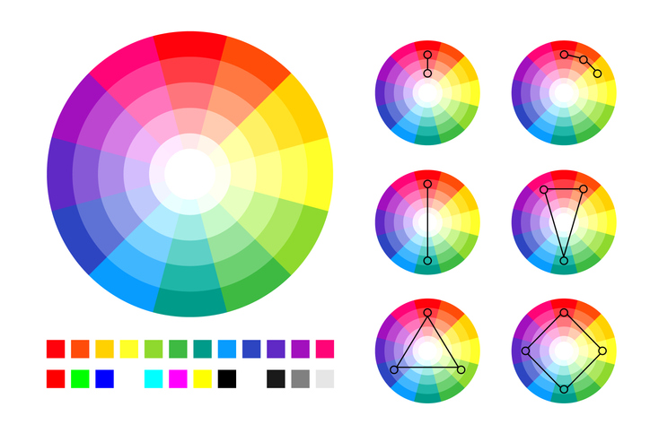
A color wheel is a representation of colors that shows the relationships between them. A color wheel is composed of the three fundamental colors: red, blue, and yellow (also called primary colors). The combination of these three colors creates the entire color wheel (which also includes secondary and tertiary colors). Image-2 shows a color wheel divided into 12 main colors.
Color Harmony
Color harmony is the art of color combination in a way that makes a delightful color balance which makes the design pleasing to the eyes. As you can see in Image-2, there are three basic color harmony categories.

Image – 2. three categories of color harmony
Color Context
Color context is the understanding of a color reaction to other colors and the design elements. A designer knows how colors are perceived by the eyes based on the background and the elements in the design. In Image-3, it seems like the small squares have different colors, but don’t believe your eyes. They are actually the same!

Image – 3, example of color context
Colors in the healthcare industry
For most of you in the healthcare industry, dark blue is typically the main color used in your color pallets. You may wonder why dark blue? We think it is because blue represents trust, wisdom, and confidence. It also represents being calm and relaxed, which is what hospitals and healthcare facilities want their patients to feel. The Image-4, below, was comprised by 99designs with a comparison of over 900 healthcare logo color palettes that shows blue as the most used color.
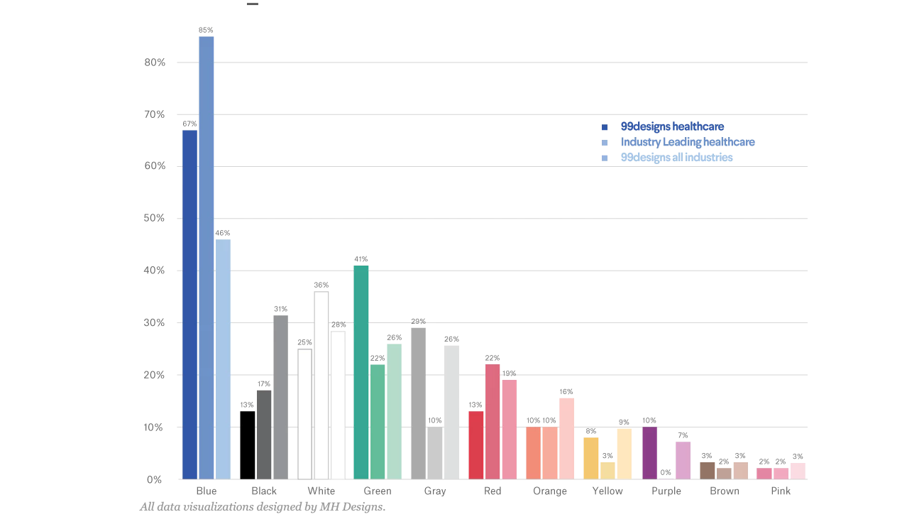
Image – 4
Some other colors popular in the healthcare industry are green, red, purple, and pink. Although they are mostly used as secondary colors, some healthcare organizations use those colors as their primary color as well.
Colors theory in your marketing
Understanding color theory and its impact on an audience and channel are the primary responsibility of the designer. However, your understanding of color theory will help convey your marketing goals for the campaign. Effectively using color theory to design a campaign will create a lasting impact of colors and feelings that drive your marketing’s message and purpose. In the end, the designer should apply color theory know-how and be careful that their color choices reflect the message behind the design and catch the attention of non-attentive viewers.