Design trends connect your organization with users.
So, what are some of the most significant design trends of 2019? You are in the right place to find out. Let’s dive into current 2019 design trends!
Graphic design is always shifting to new directions energized with innovative ideas, styles, and approaches. Keeping up with graphic design trends is essential to remain relevant and better market your organization. I’ll walk you through the current design trends that resonate with donors and prospects in the healthcare nonprofit space.
Asymmetrical layouts (open compositions)
Designs with open composition encourage users to explore the design more closely. Its dynamic style makes one wonder about the design and its message.

Vivid colors
Vivid color transitions and complex gradients are two other trends in 2019. Bright colors bring attention to the design and are easier to remember. The combination of vivid colors and gradients create smoother duotones and fades. However, it should be noted that depending on the type of business, emphasis on using color varies. We work with our clients to update their creative within their color palette or by adding additional colors, depending on the campaign.

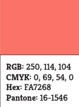
Pantone’s color of the year 2019: Living Coral
Typography
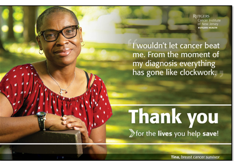
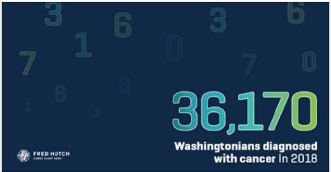
It is no mystery that typography is one of the most (if not the most) important design elements. Designers use different font styles and weights, and different text orientations to direct the viewers’ attention toward the text. A lot of new trends are frequently used now in healthcare industry designs. Text with gradients, stacked text blocks, and text on background boxes are just some of these latest trends. The main goal of these new styles is to increase the importance of text compared to other design elements. Below are some examples using Donlon Agency’s headline font (Kreon).


Photography
Warmer color palettes and authentic photos are getting more and more traction in recent years, and it doesn’t seem like it is going to stop in 2019. (Here)
I’ll write an annual trend blog once a year to review graphic design changes to help communicate your message in the best way possible. For now, it’s a good idea to adopt these new design trends in your projects and embrace them as a new challenge in your creative path.


