The urgency in design connects the targeted audience’s feeling to them then taking an action.
Building urgency into a design is a marketing technique that compels the target audience to take an action before it is too late. Urgency campaigns are very common amongst businesses in the for-profit and nonprofit sectors. There may be one in our mailbox right now or a pop-up on your web browser that is alerting you about a deal, or an event with limited time to take an action.
Using various methods in conjunction with your existing design protocol to create urgency is a key campaign component.
First, make sure there is no unnecessary element in the design that might distract the audience’s attention, like bold colors, extra graphic elements, or text that could be reduced or eliminated. For example, if there are three colors in the design, consider reducing the palette to two colors. Or if there is long text, distill the messaging down to the core CTA. This is generally called the Distraction Reduction method. To this end, use shorter sentences and less visual elements in the design. According to a study conducted by Microsoft Corp., people lose interest after only 8 seconds, specifically because, “heavy multi-screeners find it difficult to filter out irrelevant stimuli — they’re more easily distracted by multiple streams of media.” That’s why urgency campaigns are highly focused with less distraction and shorter text length. Keep in mind emails and digital media ads that are urgency-focused should have a clean, uncluttered design that is relevant for the targeted audience. (Image-1)
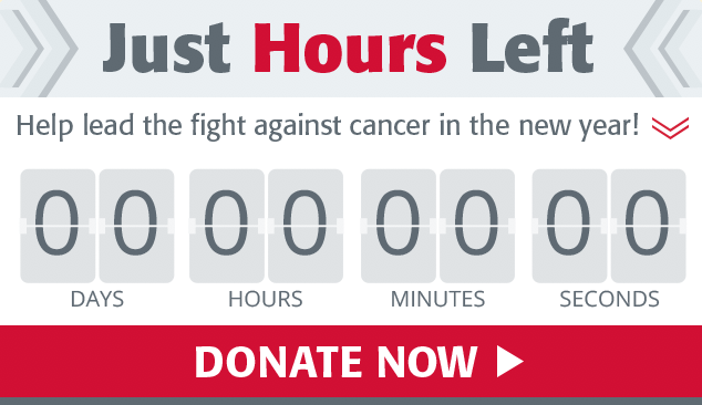
Image – 1, Rutgers Cancer Institute of New Jersey-Urgency email campaign on December 2018
Second, be sure that the call-to-action (CTA) element Stands Out. You should use the Von Restoff effect to design urgency images. This theory predicts that when there are similar items, with one different element on one of them, the distinctive element is more likely to be remembered compared to the other components. To do this, use visual elements (buttons, colors, shapes, graphic elements, images, or showing big numbers) and language (urgency words, such as “time’s out,” “hurry,” “now,” “last chance”) to emphasize the CTA. (Image 2)


Image – 2, (on the left) Rutgers Cancer Institute of New Jersey-Urgency email campaign on November 2018, (on the right) Huntsman Cancer Foundation-Urgency Facebook Ad campaign on March 2019
And lastly, be sure to Lower the Ambiguity of the design to make sure that the design is clear and understandable. Like image 3, they are Fred Hutchinson Cancer Research Center Facebook ads for March 2019 campaign. On the left is general FB ad compare to urgency ad on the right. There are less copy and added one high contrast color (red) to create urgency ad.


Image – 3, Fred Hutchinson Cancer Research Center-Urgency Facebook Ad campaign on March 2019