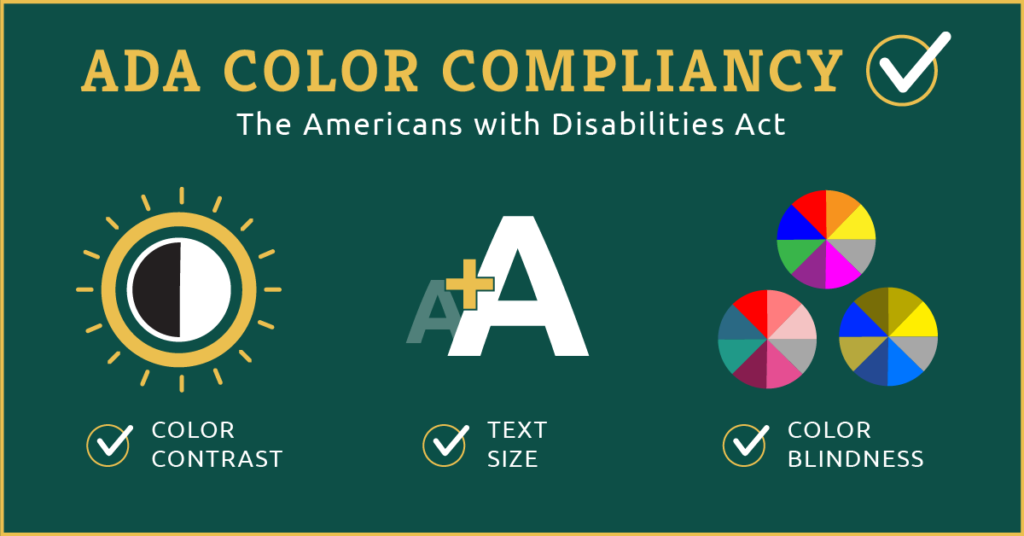
What is ADA compliance?
ADA compliance refers to the Standards for Accessible Design according to the Americans with Disabilities Act (ADA). Since 1990, it has protected and provided equal rights to people with disabilities.
ADA compliance is intended to ensure that people with disabilities have equal access to all opportunities. The Web Content Accessibility Guidelines (WCAG) is the most commonly used standard reference for ADA compliance.
Today, I’m going to focus on ADA color compliancy. This is a core focus at Donlon Agency, as we design many digital creative assets for clients, like email, webpage banners, interrupters, media ads, and more.
What is ADA-compliance color?
In some cases, it may be difficult for people with eye conditions to read or identify a message without a proper contrast between the text and the background. Colors that comply with ADA guidelines have a reasonable contrast (the difference between the brightness of two colors).
- Figure 1 illustrates an example of a non-ADA compliant image. Due to the low contrast between the background and the text, it is difficult to read the content.
- Figure 2 illustrates how we can make the background darker and create an ADA-compliant design by increasing the contrast between the background and the text. That is, by increasing the contrast ratio between the brighter and darker shades in the image, we make it easier for the audience to discern between them.
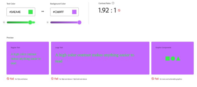
Many different tools are available for checking the contrast ratio. Here, we frequently use the Adobe Color Contrast Checker tool. On this website, when you insert the hex numbers for the text and the background, it indicates the contrast ratio between the two and whether the combination is ADA compliant. In the event that it does not pass the ADA-compliance test, we must increase the contrast until it becomes acceptable.
- As can be seen, the contrast ratio in figure 1 is 1.92:1, which fails the test.
- Figure 2 displays the same text color as Figure 1, but changes the background color. We can see that the contrast ratio has now increased to 9:1 and the ADA compliance has been met.

Why is it important for colors to be ADA compliant?
Every time you design something, you need to consider accessibility, particularly, when choosing colors for a design or brand guidelines. Colors are one of the most important aspects of design. Incorporating colors into a design can enhance the visual appeal and make graphics easier to read and see. A well-chosen color palette will enhance your design and increase viewer engagement. To learn more about color theory in design, read this blog.
Approximately 8% of men and 0.5% of women worldwide are color vision deficiency (CVD). Individuals with CVD or those with other vision problems, may experience difficulty seeing or reading when the colors do not comply with the ADA.
Colors can convey a lot of meaning, so choosing them thoughtfully is important to catch the attention of the viewer. It is possible for viewers with visual impairments to interpret colors differently when colors are used inappropriately, and therefore, the message conveyed in a design or advertisement may be misunderstood.
Here are a few suggestions for selecting colors for ADA-compliant designs:
- Ensure the color palette meets the ADA compliance requirements before building a brand guideline. If you have already created a color palette, it is still not too late to include a section for ADA compliance colors in your guideline. Our creative team can help you add this section to your brand guidelines.
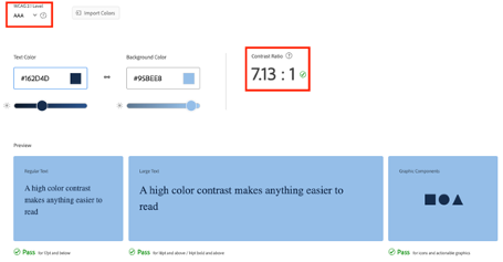
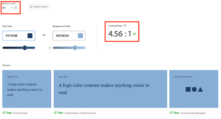
- Pick a color contrast ratio that is right for your project. According to the WCAG standard for accessibility, there are three levels of contrast checking. Level A (minimum level), Level AA (intermediate level), and Level AAA (highest level). An AAA level contrast ratio for regular text sizes is 7:1 and 4.5:1 for larger text sizes. For regular text sizes, the AA level contrast ratio should be at least 4.5:1, and for larger text sizes, it should be at least 3:1. (Figures 3 and 4 illustrate examples of Level AAA and Level AA ADA-compliant designs for regular text sizes, respectively.) For the majority of online materials, the contrast ratio should remain at Level AA.
- Consider using colors that are color blind safe. There are three types of color blindness. Red-green, blue-yellow, and complete color blindness. Red-green color blindness is the most common type of color blindness, where individuals have difficulty distinguishing between red and green. Blue-yellow color blindness is a less common type of color blindness that causes difficulty seeing the difference between blue and yellow. People with complete color blindness have no ability to distinguish between colors at all. However, this is a very rare condition.
- Adobe Color provides a great tool for checking whether the colors in your color palette can be viewed by those experiencing different types of color blindness. Figure 5 illustrates a color palette that is easily recognizable by individuals with color blindness. In the first row, the original color palette is shown, while the other three rows illustrate how each color is perceived by different types of color blindness. This palette is known as a color-blind safe palette, as any combination of colors can be used next to each other. Figure 6 illustrates an example where two colors within the palette are perceived similarly by individuals with one type of color blindness. Adobe Color adds dashes between conflicting colors to indicate those that should not be used together in a design.

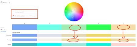
- Color is not the only aspect to consider. You might consider using another form of design elements, such as text or an icon, which can convey the same message to those who are unable to see colors.
- Make sure the proper color is used in any email body or graphical component that is clickable but has a color that differs from the rest of the text.
Useful tools to consider for ADA compliance
There are several tools and websites that can help you choose the right colors for accessibility. I have listed four below:
This is a great tool for checking contrast ratios, and it even suggests slight color adjustments so that your colors pass ADA compliancy. In order to determine the contrast ratio between two colors, you must enter the HEX numbers for the text color and the background color. On the right side of the page, you will find three options for changing colors so that they are ADA-compliant.
I found this website to be very helpful when creating a new color scheme for brand guidelines. This website can also be used to adjust a color palette that has already been established. After adding a HEX number for the background color, click the Generate color palette button. After that, you will see a wide variety of colors that have the proper contrast with the background text. The colors can be viewed all at once or individually.
Accessible Color Contrast Checker
When you already have a color palette but are uncertain about which colors will look good for text or background, this website is a great resource. It is also possible to upload and preview .jpg files and see the color ratio of an image.
The purpose of this tool is to help designers develop color palettes with combinations of colors that adhere to accessibility guidelines.


