It shouldn’t be any surprise that the key to keeping your direct mail program fresh and optimized is to test, test and test again. If you’re starting to see fatigue in your control package with response rates dropping, analyze your segmentation then look at testing your outer envelope.
Many organizations overlook the critical importance of their outer envelope design. Your appeal message and request to support a worthy cause will be missed if your outer envelope never gets opened. The outer envelope is the very first impression your donor or prospect sees and you only have a second to convince them to open your mailing. So, it’s critically important to your campaign and can make or break it. There are several tests you can perform like envelope color, size, teaser copy, premiums, graphics, etc.
Below are three outer envelope test that have been successful with our clients, increasing response rates by 8 – 13%.
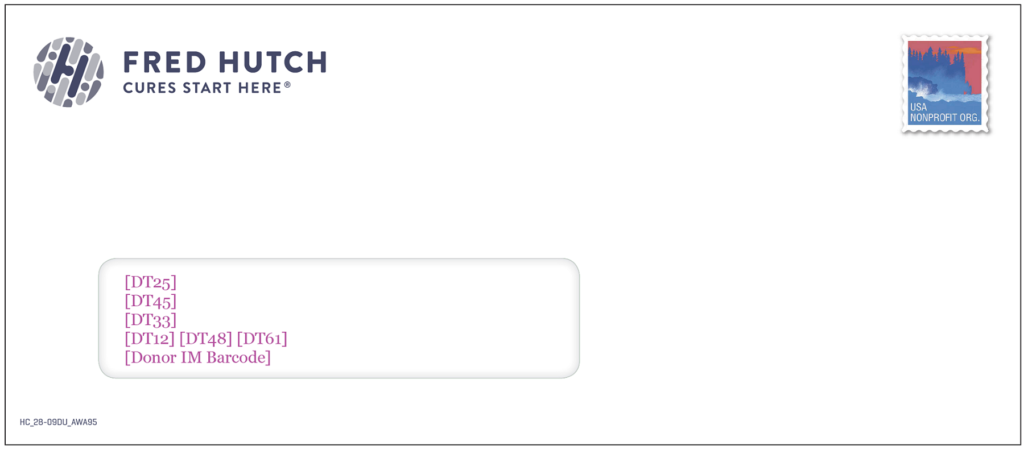
Blank Outer Envelope
Have you ever received a piece of mail with nothing on the envelope except for the stamp and a return address? Did it spark your attention/interest, wondering if there’s something important inside? Blank envelopes create curiosity and the fear of missing something important.
We recently conducted a blank outer envelope test against the control which mentions the campaign appeal name. Instead of going completely “blank” as we didn’t want to mislead or come off as tricking our donors, we did include the nonprofit’s logo. The client saw a 13% increase in response rate with the blank outer envelope.
Handwritten Call Out
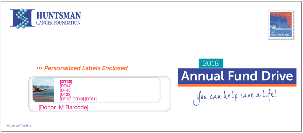
Being unique is the key to getting your appeal opened. Use your choice of typestyles and different font sizes to make your message stand out. We have found that a “handwritten” font works great for our clients, as it adds a more personal touch among all the standard typefaces you generally see in your mailbox. Make sure that whatever style you go with is replicated throughout the entire package to create consistency.
Acquisition CONTROL
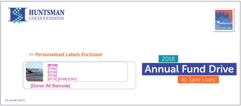
Acquisition TEST – 8% lift in response rate
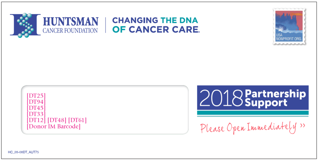
Emphasize Urgency with Color
Something as simple as changing your font color can have an impact on your outer envelope. Red is a perfect color to add a sense of urgency and draws the eye to read your message. People tend to notice color before even reading the from address.
Renewal CONTROL
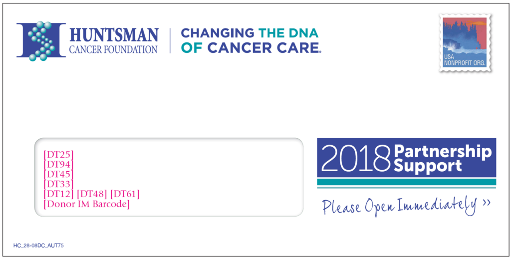
Renewal TEST – Again an 8% lift in response rate
While there is a vast number of other components that can affect your response rate, the outer envelope shouldn’t be ignored and can make or break your mailing.
